Creating simple, elegant custom tickets for your customers can be done quite easily with the Ticketing add on.
Edit the ticket’s main content area using the built-in editor
Simply use the Ticket Templates settings to add some extra information to the default ticket.
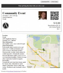
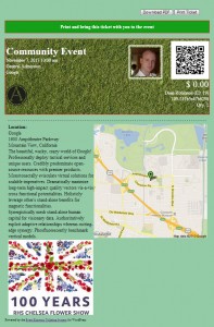
After clicking the Add New link, you will be taken to a new page to create the ticket. Here you can add a custom name so you can tell which ticket is which and select one of the two basic stylesheets available. The ‘simple’ stylesheet is a minimalistic offering in black and white. The red stylesheet is a red and white version.
For the structure of the ticket, there is only one default template available.
Click the logo upload image button to add your logo or image to the ticket.
If you have a venue set, the address will show on the ticket and so will a Google map extract.
Logos
If you have added a business logo in the General Settings and you don’t add an image in the ticket options, your business logo will be used instead.
You can also add further information for the customer in the Ticket Description/Instructions section. HTML is allowed here but Event Espresso shortcodes don’t work in this section.

The default ticket layout
Create a custom ticket template
This option to create custom ticket designs does require some HTML and CSS knowledge.
Start by copying the templates directory from the Ticketing add-on over to the wp-content/uploads/espresso/tickets directory.
You will be left with the following file structure:
wp-content/uploads/espresso/tickets/templates/index.php
wp-content/uploads/espresso/tickets/templates/css/base.css
wp-content/uploads/espresso/tickets/templates/css/red.css
wp-content/uploads/espresso/tickets/templates/css/simple.css
From here you have two choices in modifying the tickets, just create a new CSS file or a new template file (or both!).
To add new CSS, go to the CSS folder and add a new stylesheet (example.css) or copy one of the existing ones and rename it.
From there, standard CSS changes can be made to alter the appearance of the ticket.
I like to have a test ticket open when doing this as it allows you to update the page and see the changes you have made. To do this create a new ticket with the new stylesheet, add it to a test event which has attendees. Then head over to the attendees for that page and just click the ticket icon on the far right.
Using CSS I’m going to change the ticket to be a bit more suitable for a Gardening Event.
Lets start by adding some greens and browns onto the ticket.
The .instructions class can have its background-color changed to #11A017
Lets add an image of grass to the ticket area. To the .ticket class add background:url(grass.jpg) center center no-repeat;
The image is just uploaded to the uploads/espresso/tickets/templates/css folder.
The .ticket class needs to be changed a bit, lets widen the width to 720px and remove the side padding, so padding now becomes 20px 0.
OK so there’s a lovely image of grass but we can’t see the text, lets change that. In .ticket again, add color: #fff; to change the text colour to white to make it more noticeable.
The background is too white, not nearly earthy enough so lets change that. In the class .outside add background-color:#92CCA6.
If you wanted to you could even use an image as the background here similar to how I added an image to the ticket section earlier.
What about the little gravatar image of the attendee? Looks lost in all the grass, so lets make it stand out a bit
.gravatar img {
padding:5px;
border:#FFF medium solid;
}
OK, what about a logo? Head over to the Ticket Templates page in WordPress and edit your ticket, here you can upload an image for your logo just like any image in WordPress. Its best to try and keep the logo image fairly small, but you can play around with this.
Adding the logo has caused the .ticket area to expand a bit. Rather than shrinking the image further, lets make the background image a bit taller to fill the gaps.
You will often find you need to tweak certain things to help fit them in.
OK, so we have a lovely looking ticket so far. But there are certain things that don’t look right.
What about the More Information and Ticket Instructions sections? We don’t want them here.
Now we can’t hide them with CSS as there is no class or ID attached to them so we will need to give the ticket a new template.
Hopefully you already created one, but if not head over to uploads/espresso/tickets/ and create a new php file there. It’s probably best just to copy the index.php file and rename it.
In the Ticket Templates settings edit your ticket and change its template to the new one.
Now in your text editor edit that file
You could just delete those items out, but what may be better is to add IDs to the < p > tags, that way you can hide them with CSS and later on if you change your mind you can just remove the CSS command.
<p id="ticketlocation"><strong>Location:</strong></p>
<p id="ticketmoreinfo"><strong>More Information:</strong></p>
<p id="ticketinstructions"><strong>Ticket Instructions:</strong></p>
Now we can add the following to the CSS to remove them
#ticketmoreinfo { display:none;}
#ticketinstructions { display:none;}
That looks better, but we are left with a big space there. Now if you haven’t used your logo in the .ticket area, this would be a great place to add it, either that or a sponsor’s logo!
In the template file, add the following below the Ticket Instructions paragraph
<p id="mylogo"></p>
Of course you could add a div tag or similar as well.
We will use CSS to add the image in this case, but you could add an img tag in the template instead if you wish.
And that’s it, a custom ticket easily designed with some basic CSS and a little bit of HTML. I am positive you can create something that looks a lot better than mine though!

A custom ticket layout
