Posted: June 6, 2016 at 4:10 pm
|
|
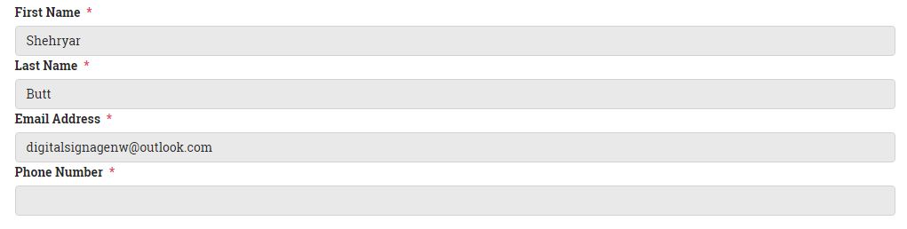
Can you please give me Css snippets / classes and IDs that I use to customize the following pages. My main thing right now is to make these pages look more attractive. Event Page I will really appreciate it. |
|
Hi there, ‘make these pages look more attractive’ is very subjective, you may like X but dislike Y, yet I like Y and dislike X. The output of those pages is also heavily dependent on your theme so whilst we can provide general classes its unlikely they would help. If you can link us to the pages and provide details of what you would like to change we may be able to help further, or you may need to contact the theme author, either way we can provide more details if you let us know what you would like to change. |
|
|
|
CSS snippets for the following pages https://apnaseattle.net/events/ In registration and checkout page, I have only 1 column for taking user information.
1 looks bad, 2 look much better. Help me with the 2 column thing. You mush have css snippet for “Event List” page and “Event” pages from somewhere. Just share some CSS classes and code with me for these pages and I will play around with them. Once again, thank you so much for all the help. |
|
http://www.dynamicdrive.com/style/csslibrary/item/responsive_2_column_form/ |
|
|
|
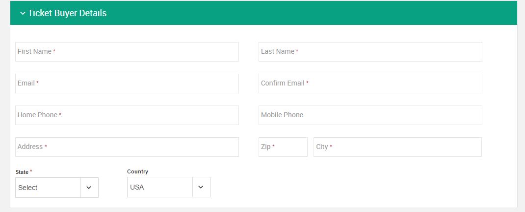
I have to say that at this point I am very frustrated my the styling of the registration page. It is hard to customize it for me. For example – Like in the picture above, I want two columns and not one for the input fields. I use something like “float: right”, I get two columns that are not in line. If I try to fix that by playing with margins and padding, as soon as the “this field is required” error massage pops up, everything goes out of wack. You guy need to really make this thing look a little better, this from looks like its from 1980s. Can you please give me a CSS code where I can have 2 columns and they are perfectly inline with each other and when the error message pops up, it does not mess with the alignment. Once aging look at the difference in the 2 pictures above. All I am asking is get me that code which will get me 2 columns that never go out of alignment Thanks for your help in advance! |
|
Thank you for the feedback. What your asking for is a customization, which we can not provide. However we can help point you in the right direction which the link provided by Josh does, did you take a look at that example? Floating the elements left rather than right will work better in this case, you’ll also need to specify the width of the inputs to make them half the size of the container. Something like this: .ee-reg-qstn {
float: left;
width: 48%;
margin: 1%;
}
Will display the questions in 2 columns. You’ll then need to apply padding to the required text to align it, something like: .ee-required-text {
padding: 1% 0 0 0;
}
However as mentioned EE does not support multi column registrations forms so this is a starting point, your likely going to need to create some media queries to apply styles for those inputs to work well on small screens. |
|
The support post ‘CSS snippets’ is closed to new replies.
Have a question about this support post? Create a new support post in our support forums and include a link to this existing support post so we can help you.