EventEspresso.com just got a fresh makeover; enjoy the new brew! ☕️
EventEspresso.com just got a fresh makeover; enjoy the new brew! ☕️
There are a number of factors you need to take into account when designing a high-converting event registration website such as the elements you’ll include on the page, where they’ll be placed, what message you want to convey, and how your copy will affect potential attendees.
Event registration websites and landing pages are incredibly diverse. Some are simple, one-page designs while others are much larger, multi-page sites. With that said, let’s take a look at some characteristics of high-converting event registration websites that are common across the board.
It’s important to remember that you don’t necessarily have to every single one of these elements in your event registration website to increase conversions. Use the ones that make sense to your particular event and regularly A/B test your registration page to maximize your conversion rate.
In this section, we’ll take a look at some examples of real event registration websites that use the elements we discussed above to persuade people to register. We’ll take a look at why their design works and how you can achieve the same for your event registration website.
One of the first things your site’s visitors will notice is its visual design. This gives you an opportunity to weave your event brand into your website’s design and leave a great first impression on potential attendees. This could be in the form of colors, fonts, themes, or logos.

SaaStock’s event website leverages the vibrant color palette they’ve selected for the event brand throughout the site’s design. In addition to this, the event website strikes the perfect balance between communicating their message and staying true to on-brand aesthetic.

Virgin’s Disruptor event uses Virgin’s brand colors throughout their event registration website. It features a simple, three-color design with the brand’s signature red being the primary color. Using the host’s brand colors makes the event brand all the more recognizable and memorable to anyone who sees it.
An on-brand event website allows you to (1) create a lasting first impression, (2) makes your brand memorable, and (3) ensures a harmonious, consistent visual experience.
Event Espresso comes with customizable event designs and a WYSIWYG editor right out of the box that enable you to create custom, on-brand designs for your event and registration pages. What’s more is that you can use the Event App Customization add-on to customize the EE4 event app to match your brand.
Strong value propositions set the foundation of your event marketing campaign. They give potential attendees a compelling reason to register for your event. That said, it’s important that the value propositions you communicate through your event website are concise. Your value proposition should effectively answer why the prospect should register for your event and give them a compelling reason to act.
SalesLoft Rainmaker Conference

The Rainmaker Conference’s details on SalesLoft’s event page have a neat About the Conference section that briefly explains what the conference is about and how attendees can benefit from it. For instance, its copy reads to gain modern sales insight from the best thought leaders in the industry. It’s clear that the conference is targeted at sales professionals. In addition to this, the four content boxes directly below the copy highlight additional value propositions – 3 days, 74 speaks, 800+ like-minded sales professionals, and 44 breakout sessions.
Publishing strong, concise value propositions to your event registration page allows potential attendees to immediately understand (1) what the event is about, (2) why they should register for it, and (3) give them a compelling reason to register right away.
The Event Espresso plugin packs easy event management functionality that allows you to control every aspect of your event. Paired with the built-in WYSIWYG editor, you’ll be able to create and keep track of your event’s value propositions directly from your site’s admin panel.
As an event organizer, you already know how your event is different than other similar events. These are your unique selling points. Unique selling points answer the question: How is this event any different than the others? Highlighting your event’s unique selling points throughout your event registration website is the key to successful event marketing. Your unique selling points could be anything from your speaker lineup to the venue.

The unique selling point for the CX Summit, for example, is their keynote speakers. As you can see from the event’s registration page, each speaker has their own speaker card that consists of their name, designation, company, a profile picture, and a description that highlights their achievements, industry experience, and knowledge. Using speaker cards, CX Summit was able to effectively communicate their unique selling point by drawing attention to their speaker lineup.
By dedicating a significant amount of your event registration website’s screen real estate to highlighting your event’s unique selling points, you’ll be able to (1) let potential attendees know how your event is different from others, (2) explain how they can benefit from attending your event, and (3) persuade them to register for your event.
Event Espresso’s People add-on allows you to create a custom, unique interface from where you can manage speakers and event sponsors without having to leave your WordPress website.
The purpose of your event registration website might be to get people to register for your event, sell tickets, or simply get prospects to RSVP. Your call to action should motivate visitors to act on your conversion goal. If you were trying to get registrations, your call to action would prompt them to register for your event.
Following best practices, your call to action button should stand out. Try using buttons and colors that don’t blend in with your site’s design. Finally, remember to optimize the call to action text. For instance, you might want your call to action to be a bit more exciting than Register. You could go with something like Reserve Your Seat, I’ll be there!, or Book now for early bird prices.
ZoomInfo Growth Acceleration Summit
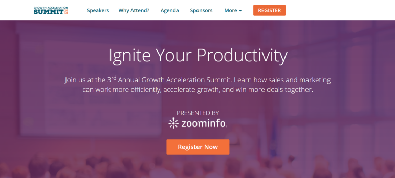
The Growth Acceleration Summit’s event registration page features two call to action buttons above the fold. Both use colors that stand out from the rest of the website’s design which is why the visitor’s attention is immediately drawn to them when they land on the homepage.
Using a prominent call to action button with actionable text captivates the visitor’s attention and motivates them to act on your conversion goal.
The Event Espresso plugin features built-in event registration forms that are fully customizable and allow you to add compelling call to actions to your registration form.
Your event registration page directly impacts how many people register for your event, how many RSVPs you get, and how many event tickets you sell. Designing an event registration website that drives conversions doesn’t have to be difficult.
Let’s quickly recap the steps you need to take to create a high-converting event registration website:
What are some of the ways you maximize your event registration website’s conversion rates? We’d love to hear from you so let us know by sending us an email!
Event Brand
Value Propositions
Unique Selling Points
Call to Action