Posted: January 11, 2023 at 12:41 pm
|
|
Hi I am having difficulty following some support advice previously given on these forums on how to remove the “state” and “country” options on the stripe payment registration page I think this is because unlike the plugin for EE3 it now uses the general HTML address form and so all of the locked default form questions are used on this page Is there a code I can use to nullify these input boxes so they arent displayed at all or is there just a way I can take the lock off the registration form setup so that I can remove the State and Country options rather than just untick them? Hope this makes sense thanks |
|
Hi there, Apologies but I don’t follow what you are trying to do, can you add a screenshot showing the sections? https://eventespresso.com/wiki/troubleshooting-checklist/#screenshots Apologies, it’s likely me just having a moment here but I’ve gone over your post 3 times and it’s just not sinking in. |
|
|
|
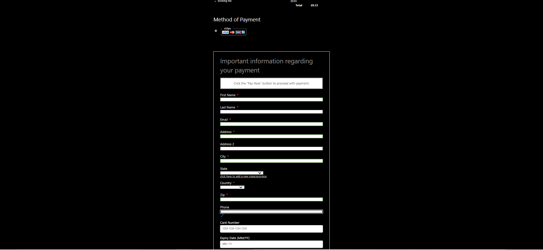
Hi Tony thanks, here is the example of the form that is shown when Stripe is asking for the payment details. As we are in the UK the state selection and really even the country is unnecessary, I have the state selection turned off in the registration form options as shown on the other screen shot so really can’t see where the state drop down can be hidden. I’m hoping it can be deleted so it all makes a bit more sense for our registrants https://justthetick.et/events/wp-content/uploads/2023/01/screenshot-.jpg I’m also trying to work out how to alter the text and button text within these pages so that it is a bit more specific to the nature of our events but I will worry about that bit next… hope you can help! |
|
|
Sorry that second link is supposed to read https://justthetick.et/events/wp-content/uploads/2023/01/screenshot-.jpg |
|
|
https://justthetick.et/events/wp-content/uploads/2023/01/screenshot-2.jpg |
|
|
https://justthetick.et/events/wp-content/uploads/2023/01/screenshot-3.jpg From what I can see if it was possible to lift the locks on this page then it would surely be simple to delete the fields and then them not come up, they look odd on the page due to the drop down box being a different depth to the other parts so if I could turn it off that would solve that the initial page screen shot is from the stripe section of the registration-checkout page |
|
|
Also, how does one change the text for the zip section on this page to postcode? |
|
Right… ok! Makes sense now. Again, my apologies. The simplest option is to disable the address fields on the Stripe payment method form. Event Espresso -> Payment methods -> Stripe Set ‘Collect the user’s billing address?’ to No. EE will not longer request the billing address for Stripe. However, that’s the sledgehammer approach and I’m aware you likely want to collect those details for the payment. —- I need to clarify the sections regarding the state input, the section you are editing here: https://justthetick.et/events/wp-content/uploads/2023/01/screenshot-2.jpg Is the ‘Address Information’ question group shown on the registration form. The state field you are trying to remove is from the Stripe payment method Billing Form, they aren’t the same sections so change you make to the reg form question group don’t apply to the Billing Info form (you may only collect say Address line 1 on the registration form but your payment method my require the full address, which is why they aren’t tired together). We don’t have a section used to edit the Billing info form specifically and to give some context, some payment methods require X,Y,Z fields, others maybe Z, or X, or only Y and Z and not Z. So each payment method handles the sections it requires within its own billing form. Now, there’s a hook available which allows you to change those and remove them. We allow for it via code as it’s then expected for whoever changes those fields to manage what the payment method does and does not require etc. Normally I would give you a snippet showing how to do this, however, during testing this I’ve discovered a bug in the Stripe payment method which causes a fatal error if you remove the state field. It’s either a bug or the code was set that way because the state field is required. I have created a ticket for our developers to investigate this further but for now it means the only option you have to remove those fields is to disable the billing address fields mentioned above. |
|
|
|
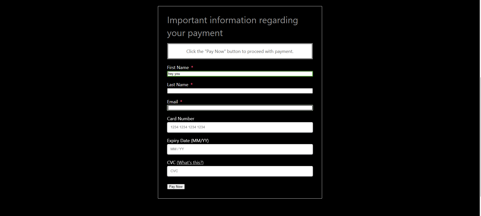
Right, actually the sledgehammer technique will suit me fine and also explain why I didnt have this problem before I disabled the plugin and then re-enabled it. Sorry that I didnt notice this option was there to be re-set this time around and thanks for your help I see what youre saying about the state option being essential but this solution really does suit fine thank you Just looking at the forms now without those address options the card number section is a different size box to the name input section, shown here in the screenshot: https://justthetick.et/events/wp-content/uploads/2023/01/screenshot-4.jpg Have you any idea why that would be and is there an easy way to make it all a bit more uniform? (worried people might be reluctant to enter details to a slightly uneven looking form) Thanks Tony that was a great help As the next challenge just before being in a position to go live with our site are you also able to point me towards threads showing how to edit the text instructions at the top of the registration pages please? Here’s the example text: 1 Attendee Information»2 Payment Options |
Hmm little more complicated (you basically just need some additional CSS. The reason they are different is the card section is actually loading from Stripe, it’s their styling applying to those 3 fields. Its called Stripe ‘elements’ in that each individual input (aka element) loads from Stripe itself an the reason for that is it means the card details are input directly to Stripe themselves and not to your server to then be sent to Stripe….. it lowers your PCI Compliance levels but means the styling is controlled by Stripe. Can you link me to an event I can run a test registration on to view the fields?
This needs to be done via code and I’ll give you and example of how to do it via a snippet. What change are you looking to make? |
|
Nevermind, I found one 🙂 You can add some custom CSS for this, go to Dashboard -> Appearance -> Customize. At the bottom of the sidebar on the left you’ll see ‘Additional CSS’, add this there: |
|
|
|
Sure thanks here is the test event justthetick.et/events/27-01-23 I understand about the stripe and wondered if it woul dbe something like that but wonder if it would be possible to make the text higher to match it? I am looking at just simplifying the various bits of text to make it more relevant to a nightclub setting, I’ve found the bits of code to add to the custom plugin that chage the button texts and theyre great, just about getting my head around that now so this is brilliant, thanks |
|
|
Perfect that has worked a treat! Thanks |
|
You’re most welcome 🙂 I assume you’ve managed to change the text to what you wanted? |
|
|
|
Looking at it again I think the text that is used for that page is actually pretty good for what it does, thanks for your help I think we are good to go live now |
|
|
Actually one last thing soz Ideally I would like to alter the ‘Important information regarding your payment’ text on the same stripe screen so that the text is normal text size and not a header size font, I cant find mention in the previous posts of how this can be done (I’m sure you know how to do it though!) Could you help please? 🙂 |
|
|
Though it appears that this forum post will solve the problem it actually appears out of date, the input box mentioned changes the attention box below the “Important information regarding your payment” text On reflection just removing the “Important information regarding your payment” would probably be the best solution for me |
|
|
Sorry this was the forum post I was referring to that no longer seems to be relevant https://eventespresso.com/topic/edit-checkout-text-important-information-regarding-your-payment/ Also having puzzled thorugh some more alterations I have 2 requests before (hopefully!) reaching Event Espresso bliss On the Thank you confirmation page the headers for each section (registration details / payment overview) are massive, I know they are <H3 > but I cant see a way to alter those using css, I would just like them smaller if that’s possible please And one last thing thats a bit annoying.. On the stripe entry form again there is a 1 pixel coloured border that comes up around the last box I was active in when the cursor is moved to another part of the form. I can see that the colour it is showing (in my case bright green) is a default original colour from my theme (its not used anywhere else on the site as I changed all of these out from the theme early on) its barely noticeable but in the aims of getting the perfect site I’d like to change this to a dark blue if possible If i could find out how to change those headers (hide or change the size) on the thank you screen and also the stripe payment screen to make it all a bit more compact and then also manage to change the border color then I think we have just about got our site ready, thanks for your help |
|
|
Any help would be amazingly amazing! |
That forum post is correct for changing this text: https://monosnap.com/file/9ENSgnIb7BtdXSEAhYLt7YxEjl6ghb Setting the header size of the text above can be done with some CSS: You can hide th header and description if preferred using:
Can you either enable the Invoice payment method so I can finalize a registration to view the thank you page… Or, post a link to the thank you page for one of your test registrations so I can view it through that (you can mark your reply private so only EE staff can view it)
Sure, but which blue? This removes it: But you can set the colour to whatever you prefer there. |
|
|
|
Thankyou! Here is a link to a thank you page for a registration made last night. https://justthetick.et/events/thank-you/?e_reg_url_link=1-e333de4fcfb560f5932e103153b7d955 I have added those CSS and they seem to be working great Its good to be able to remove the border colour but as I know you like to be thorough and it would be interesting to see the difference in code if you could show me how to change the colour that would be brilliant, my choice of alternative blue for the border would be #183d8b Amazing, thanks |
|
|
Also are there any instructions on how to customise the ticket selector? It would be great to be able to alter things like the font for the title row and font colour for the price and other things within the tables to reflect a coloured theme if possible The one I have at the moment I have used on our event page which is now at justthetick.et/events/kingsofthejungle And then also it would be nice to change the button that is clicked on to proceed on each page, though I havent checked the support forums to see if there are instructions for that yet I would like to change the text font for the dialogue plus the background colour and possibly.. is this best done with html or can I insert an image in there? I need that for each page if possible. Event Espresso is already well outstripping my expectations and so this is over and above what we need but to be able to customise these few little bits should be able to give us a really custom sort of check out … plus of course the informtion would all be here should anybody else ever need it Thanks! |
You would just replace the ‘unset’ with the colour itself, so:
Not the ticket selector no, for multiple reasons. The ticket selector is one of the most critical sections of Event Espresso, it has a huge amount of logic behind it because of the various event setups and use cases people have for it, then add-ons come along and use it differently etc etc. If we provide multiple different ways for people to customize the ticket selector then we start running into various ways in which people can (and will) break the HTML markup within it… which then leads us down multiple support rabbit holes to figure out and fix. For example when the dropdown selections stop working or show the TKT ID has been added to the cart rather than the actual qty (“1214 items have been added to the cart” when in fact it was a qty of 2 for example) which then turns out to be custom code changing some of the Ticket Selector markup which was never intended to be switched out (Yes thats happened and yes, it was a rabbit hole to find 🙂 ). So customizing the ticket selector is something we don’t provide support for currently. Changing colours etc with CSS I can help with but you’ll need to be a little more specific on the changes you want to make for me to advise further. If you can add a screenshot showing the changes you are looking to make I can probably advise further from that. https://eventespresso.com/wiki/troubleshooting-checklist/#screenshots |
|
|
|
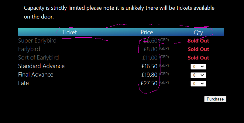
Understood! I was just wondering if its possible to seperately bold the ticket / qty / price title row at the top and then maybe change the colour of the price text running downwards in the column, just to make it look a bit more substantial. Also is there a code to stop the GBP currency code being displayed in brackets after every price? Ideally I would also like to carry out some changes to all of the the ‘proceed’ buttons, Font and colour. If there is some CSS then im looking to change the button background colour and also use a font i have uploaded to my domain for the text on the button Heres an example just highlighting what I mean. please forgive the crude circling https://justthetick.et/events/wp-content/uploads/2023/01/ticketingexample.jpg |
|
|
By the way since starting to type that post and pressing enter we have sold our first 4 tickets on this install…. Go EE!!! 😀 |
So just making the headrs bold? You’re explicitly setting those to be lightly already within reaktiv custom CSS?
Same here, there is custom CSS to do the opposite of the above?
Sure, you need:
You can add that to a custom functions plugin on your site, we have some documentation on creating one here: https://eventespresso.com/wiki/create-site-specific-plugin-wordpress-site/ |
|
|
|
Yes I am just looking to make the headers bold, sorry I did realise I had some code in there doing something but really I’m just looking to seperate out the commmands a bit if possible I added the lighter code using advice from some other forum posts in order to remove the bold from all of the text in the table. It is set as bold as standard for all the text but really i would just like it from the top ticket down And then the colour change for the price column down if poss, that would be pretty swish Sorry but I also need to add code which will allow me to add [inc BF] either after the ‘price’ text in the header or actually in place of the currency code which you just so wonderfully gave me the code to remove would probably work better That would be ideal as I have just realised that people are still going back to our old ticket seller despite us being cheaper, maybe because their ticket looks cheaper initially as they don’t have the booking fee included Thanks as ever Dan |
|
Ok, so I’m not 100% sure I follow what you’re looking to do, but I’ll explain how to break down the CSS rules and can help you from there. You said you wanted to separate out the commands, so what you have now is: The But when the styles for all of them are all the same you group them together and separated out with a comma.
I don’t follow this sorry, so you want the headers bold but the ticket rows not?
Down? Can you take a screenshot and show what you are trying to do please? https://eventespresso.com/wiki/troubleshooting-checklist/#screenshots
You can’t add it in place of the currency code, but the header is possible, I’ll put together a snippet for this. |
|
The support post ‘How to remove Stripe plugin "State" and "country" drop downs in EE4?’ is closed to new replies.
Have a question about this support post? Create a new support post in our support forums and include a link to this existing support post so we can help you.