 If your event registration form isn’t optimized for conversions, you could be driving away attendees without even knowing it.
Minor changes in the form’s design and layout – such as following the asterisk standard or grouping related fields together – can improve your form’s user experience significantly and simplify your registration process.
In this article, we’ll share some best practices for designing high-converting registration forms for your event.
Article Outline
#1: Only Ask for What’s Necessary
Presenting a long registration form the moment a prospective attendee decides to register for your event is a surefire way to discourage them from attending. More often than not, they’ll realize that attending the event isn’t worth the energy cost of filling out the form.
This is the main problem with collecting information from attendees. You want to collect as much information as possible. They want to fill out registration forms as fast as possible.
One way to make your event registration forms as simple as possible is to ask only for what’s strictly necessary. Here are some best practices to keep in mind:
- Don’t ask for the same information twice. Asking attendees to confirm their email address or password adds unnecessary fields to your form.
- Distinguish between optional and required fields. This lets your attendees know the bare minimum information they need to provide in order to complete registration and allows them to skip over the optional fields.
- Ask only for the information you need to register the attendee. At the event registration stage, your main focus should be to register prospective attendees for your event, not gather as much information as possible. You can always ask for more information after they’ve completed their registration.
The VRX event registration form is simple and the required fields are clearly marked. However, asking attendees to re-enter their email address isn’t necessary.

No Code conference’s registration form asks only for what’s necessary and distinguishes between optional and required fields.

#2: Utilize Gestalt Design Principles
Applying Gestalt design principles to your event registration forms can make your forms feel more scan-able and organized. Let’s step through the three principles that apply to form design – proximity, similarity, and continuity.
Proximity
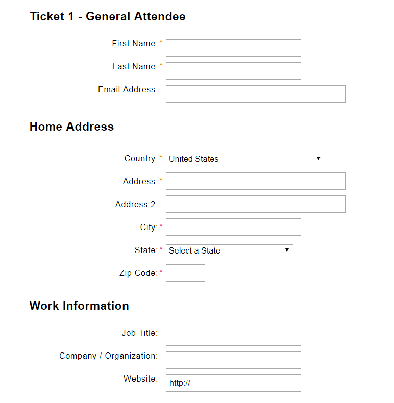
Placing related fields close to each other defines groupings and makes it easier for the attendee to fill out their information. For example, you could group Name and Email Address together and create a separate grouping for payment information.
Notice how the registration form is split into three groups – General Attendee, Home Address, and Work Information?
Similarity
Field labels and buttons should maintain similar formatting throughout your event registration form. In the case of field labels, pick an alignment (left, right, center, or top) and stick with it. In addition to this, you should use consistent and standard symbols. For example, the asterisk (*) is commonly used to mark required fields.

Continuity
The continuity principle states that once the user’s eye begins following something, it will continue traveling in the same direction until it encounters another object. Keeping this in mind, you can either implement a horizontal form layout or a vertical form layout.
The horizontal form layout works great on devices that have lots of horizontal space e.g. desktops and tablets. And the vertical form layout is best suited for devices that have more vertical space e.g. smartphones.

Splitting form fields into multiple columns breaks continuity because an attendee’s eyes may jump between the fields on the left and the fields on the right as they complete the registration form.

#3: Provide Visible and Specific Error Messages
Configure your registration form to validate attendee responses in real-time. This way, they won’t have to wait until they’ve hit the Submit button to find out if they’ve made a mistake in filling out the form.

Best practices indicate that your error messages should be quickly noticeable at a glance. Additionally, it’s better to display the error message near the erroneous field instead of at the top or bottom of the page. You can use colors, graphics, and text notices to let attendees know that they’ve made a mistake filling out a particular field and present helpful information on how they can fill it out correctly.

To take things a step further, you can prevent attendees from making mistakes in the first place simply by displaying helpful messages near your input fields. For example, when a user creates a Gmail account, the form lets them know that their username can contain letters, numbers, and periods. This way, users are less likely to enter hyphens, underscores, and other special characters.

#4: Start With the Easy Questions
Once a prospective attendee starts filling out the event registration form, they’ve already invested their time and effort into it. And if you’ve followed Gestalt design principles, your form should appear to be short, organized, and easy to scan.

For this reason, asking attendees to fill out the easy questions (such as attendee’s name, email address, phone number, etc…) first ensures that they’ll invest more time into it. These are simple questions that don’t require a lot of thought, and the attendee can fill out quickly.
There’s also a chance that the answers might already be stored in the attendees’ web browser. However, if you require attendees to login before registering, you can pre-populate these fields for them.
#5: Allow Users to Register Multiple Attendees
Instead of having attendees fill out the registration form multiple times to register their group, family members, students, or colleagues, make it easy for one person to register multiple attendees at the same time. Doing so reduces form fatigue and allows the attendee to complete the registration process much faster.

Conclusion
Your event registration form is one of the first touch-points you’ll have with your attendees which is why it’s important to focus on its design. To improve your form’s conversion rate, you’ll want to take measures to make your registration form as short, organized, and easy to fill out as possible.
Let’s quickly recap the main points we covered:
- By eliminating unnecessary questions, you can effectively reduce form fatigue and increase form completion rates.
- Applying the Gestalt design principles to forms can make them appear organized and scannable.
- Providing visible and specific error messages inline helps to identify mistakes in real-time.
- Ask the easy questions (name, email address, and phone number) first.
- Allow one person to register multiple attendees to speed up group registrations.
The core Event Espresso plugin comes with a feature-rich event registration form builder that you can use to create high-converting registration forms for your own event website. The best part is that you can do all of this without having to leave your WordPress website or integrate it with a third-party platform.