In this guide, we’ll show you how to style the buttons that are used on the front end for Event Espresso. Below we have examples of the buttons that you’ll see during registration checkout. The buttons below are from the Twenty Twelve theme which includes basic styling for buttons.
 |
This button is used after entering registrant details and will take you to the payment options page |
 |
This button is used to finish up a registration and will take you to the thank you page |
 |
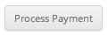
This button is used to process a payment if the initial payment attempt fails |
 |
This button is used to update the registration details for an existing registration |
Some themes include existing styling for buttons while others do not. If your theme does not have existing styles for buttons, then your buttons may appear as a default grey.
These buttons can be styled to any color by using CSS and these styles can be added to your child theme’s stylesheet or through a plugin like My Custom CSS or Reaktiv CSS Builder.
Proceed to Payment Options button style
A tool like Firebug or Chrome Developer Tools can be used to inspect the buttons to see the CSS classes and ids that are in use. Here is an example from Chrome Developer Tools for the Proceed to Payment Options button:
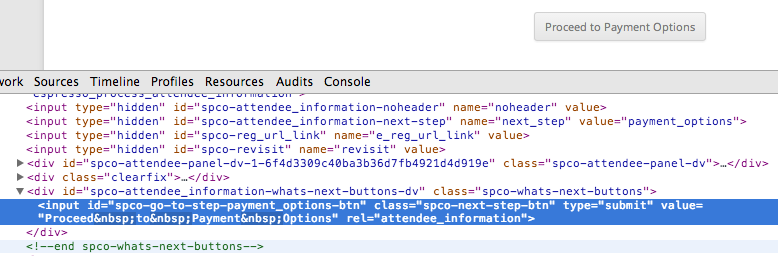
The screenshot shows that there is a CSS id of spco-go-to-step-payment_options-btn and a CSS class of spco-next-step-btn. We can then use this information to change the style for our button. The following code will change the color for the Proceed to Payment Options button from grey to blue:
#spco-go-to-step-payment_options-btn {
   border-top: 1px solid #96d1f8;
   background: #65a9d7;
   padding: 5px 10px;
   -webkit-border-radius: 5px;
   -moz-border-radius: 5px;
   border-radius: 5px;
   -webkit-box-shadow: rgba(0,0,0,1) 0 1px 0;
   -moz-box-shadow: rgba(0,0,0,1) 0 1px 0;
   box-shadow: rgba(0,0,0,1) 0 1px 0;
   text-shadow: rgba(0,0,0,.4) 0 1px 0;
   color: white;
   font-size: 14px;
   text-decoration: none;
   vertical-align: middle;
   }
#spco-go-to-step-payment_options-btn:hover {
   border-top-color: #28597a;
   background: #28597a;
   color: #ccc;
   }
#spco-go-to-step-payment_options-btn:active {
   border-top-color: #1b435e;
   background: #1b435e;
   }
To apply these new styles, just copy and paste them into your child theme’s stylesheet or into a plugin like My Custom CSS or Reaktiv CSS Builder.
Finalize Registration button style & Process Payment button style & Update Registration Details button style
The Finalize Registration button, Process Payment button, and Update Registration Details button have a CSS id of spco-go-to-step-finalize_registration-btn and a CSS class of spco-next-step-btn. The following code will change the color for the Finalize Registration button, Process Payment button, and Update Registration Details button from grey to blue:
#spco-go-to-step-finalize_registration-btn {
   border-top: 1px solid #96d1f8;
   background: #65a9d7;
   padding: 5px 10px;
   -webkit-border-radius: 5px;
   -moz-border-radius: 5px;
   border-radius: 5px;
   -webkit-box-shadow: rgba(0,0,0,1) 0 1px 0;
   -moz-box-shadow: rgba(0,0,0,1) 0 1px 0;
   box-shadow: rgba(0,0,0,1) 0 1px 0;
   text-shadow: rgba(0,0,0,.4) 0 1px 0;
   color: white;
   font-size: 14px;
   text-decoration: none;
   vertical-align: middle;
   }
#spco-go-to-step-finalize_registration-btn:hover {
   border-top-color: #28597a;
   background: #28597a;
   color: #ccc;
   }
#spco-go-to-step-finalize_registration-btn:active {
   border-top-color: #1b435e;
   background: #1b435e;
   }
To apply these new styles, just copy and paste them into your child theme’s stylesheet or into a plugin like My Custom CSS or Reaktiv CSS Builder.
View Details and Register Now button style
The following buttons are not using during registration checkout but CSS examples are included below.
 |
This button is used on the event list page |
 |
This button is used on the single event pages |
The View Details buttons and Register Now buttons will have different CSS ids for each event. For example, if our event had a post id of 123, then the CSS id would be ticket-selector-submit-123-btn.
The following code will change the color for the View Details button and Register Now button for a specific event with a post id of 123 from grey to blue:
#ticket-selector-submit-123-btn {
   border-top: 1px solid #96d1f8;
   background: #65a9d7;
   padding: 5px 10px;
   -webkit-border-radius: 5px;
   -moz-border-radius: 5px;
   border-radius: 5px;
   -webkit-box-shadow: rgba(0,0,0,1) 0 1px 0;
   -moz-box-shadow: rgba(0,0,0,1) 0 1px 0;
   box-shadow: rgba(0,0,0,1) 0 1px 0;
   text-shadow: rgba(0,0,0,.4) 0 1px 0;
   color: white;
   font-size: 14px;
   text-decoration: none;
   vertical-align: middle;
   }
#ticket-selector-submit-123-btn:hover {
   border-top-color: #28597a;
   background: #28597a;
   color: #ccc;
   }
#ticket-selector-submit-123-btn:active {
   border-top-color: #1b435e;
   background: #1b435e;
   }
The CSS class of ticket-selector-submit-btn applies to all View Details and Register Now buttons. The following code will change the color for all View Details buttons and Register Now buttons from grey to blue:
.ticket-selector-submit-btn {
   border-top: 1px solid #96d1f8;
   background: #65a9d7;
   padding: 5px 10px;
   -webkit-border-radius: 5px;
   -moz-border-radius: 5px;
   border-radius: 5px;
   -webkit-box-shadow: rgba(0,0,0,1) 0 1px 0;
   -moz-box-shadow: rgba(0,0,0,1) 0 1px 0;
   box-shadow: rgba(0,0,0,1) 0 1px 0;
   text-shadow: rgba(0,0,0,.4) 0 1px 0;
   color: white;
   font-size: 14px;
   text-decoration: none;
   vertical-align: middle;
   }
.ticket-selector-submit-btn:hover {
   border-top-color: #28597a;
   background: #28597a;
   color: #ccc;
   }
.ticket-selector-submit-btn:active {
   border-top-color: #1b435e;
   background: #1b435e;
   }
To apply these new styles, just copy and paste them into your child theme’s stylesheet or into a plugin like My Custom CSS or Reaktiv CSS Builder.
There are several resources available for creating CSS buttons: